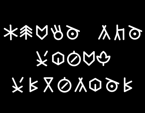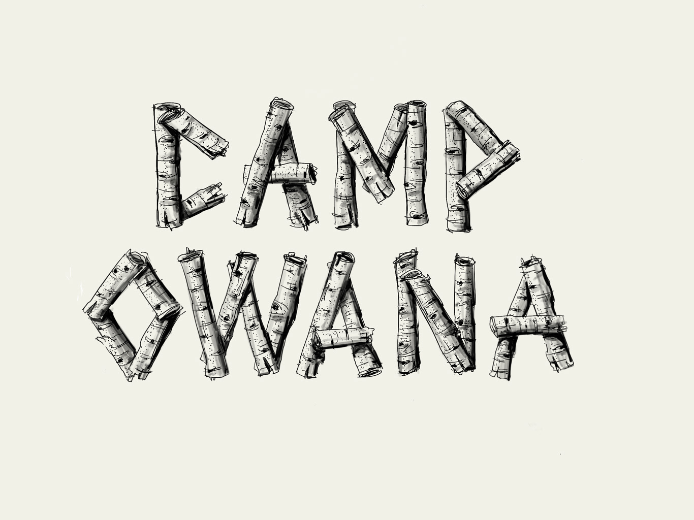
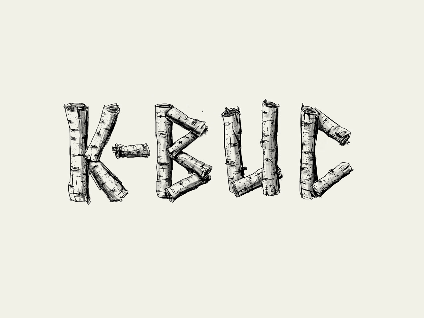
This is a work in progress. Beyond the fun of doing a display typeface of this sort, it originated with an Instagram conversation with Jason Engdahl, aka @njorg over our mutual love of what he was calling Woodencaps. We agreed to collaborate on a project. My noodling around led me to go in a slightly different direction and this is where I'm ending up. I love the sketchy and dirty quality of this as I'm building up the letterforms on my iPad tablet.