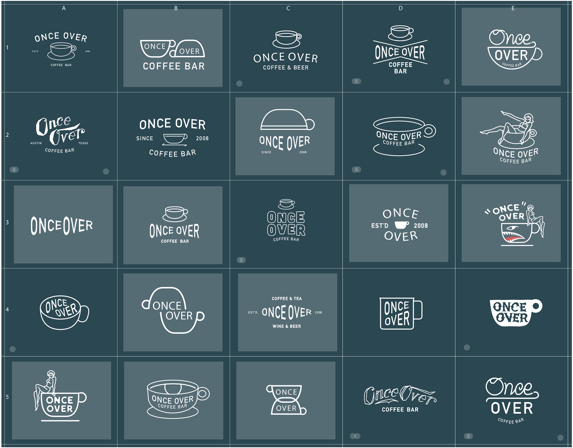
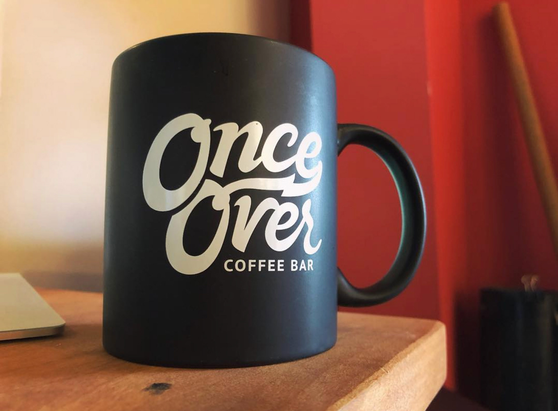
The client has deep roots in punk and rockabilly culture, and wanted to maintain that vibe, but with an updated appeal. "More rock, less banjo" was the defining directive for the brand. It was also discussed that the brand needed to be able to fit on round stickers for the coffee cups, but also fit within a square or rectangle for signage and other options.
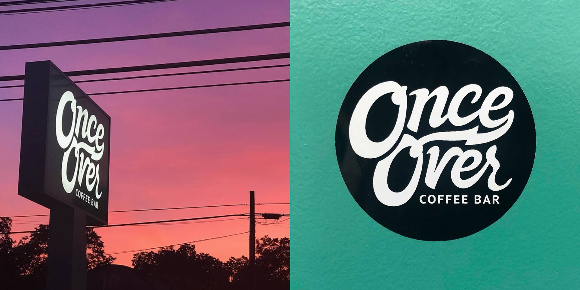
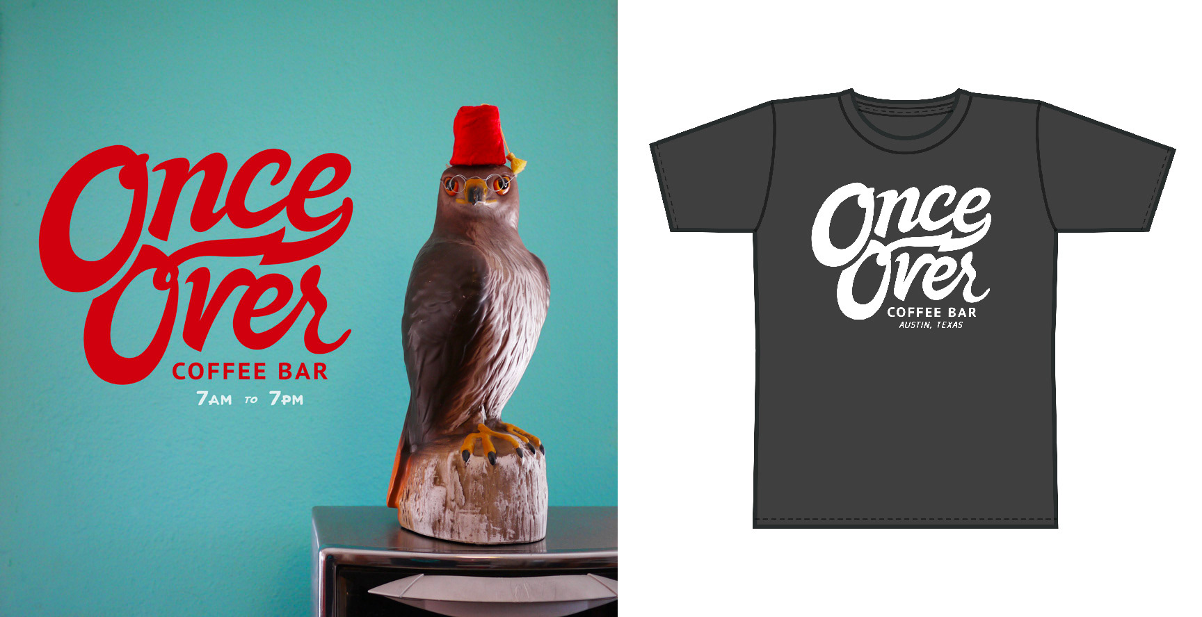
Ultimately, we all agreed to continue with the black & white vibe, but allow for some flair with a signature color.
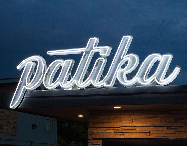
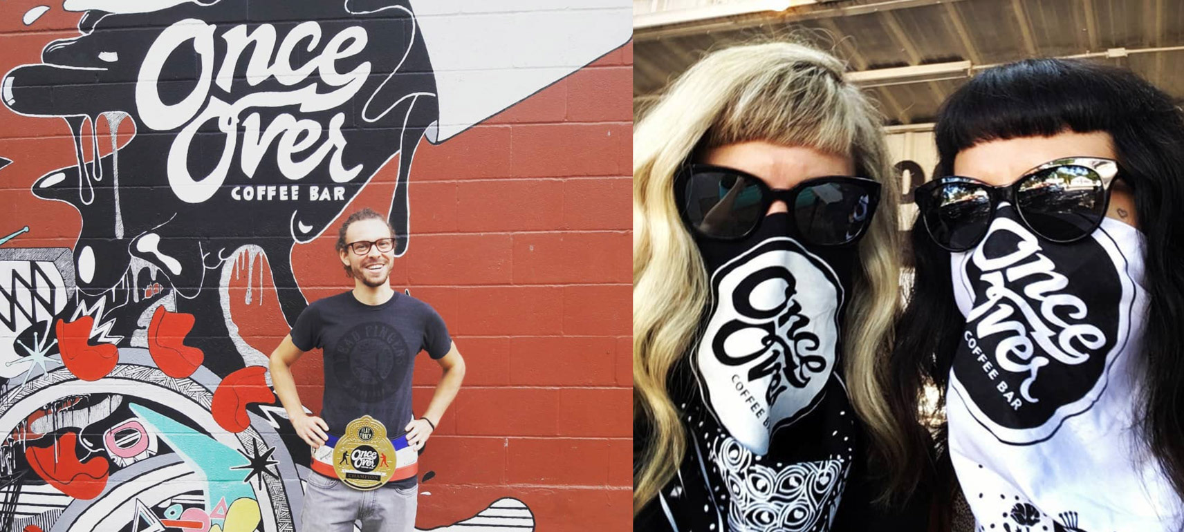
Having fun with how it appears out in the real world, on social media and other areas was key for the brand.
Once Over competes regionally and nationally, and it's baristas are often ranked very high. Ultimately though, Once Over is about community and culture, and it really shows.
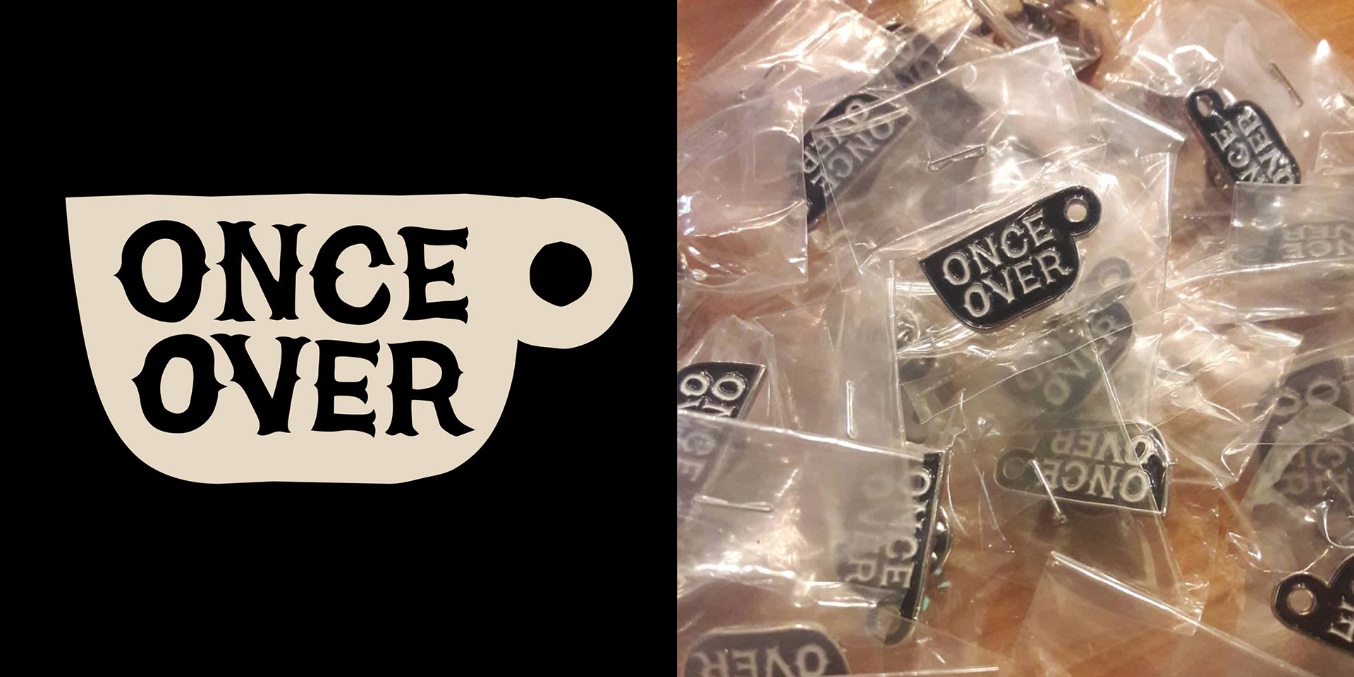
Early iterations on the brand. The original approach was to not have one definitive mark, but to have several expressed in different ways. The words 'Once Over' are such a distinct and pairing of words—originally from the title of a song from the band 'X'— that it made sense to really focus on the logotype as brand.